I recently tested Creatie, a new platform that promises to give Figma a run for its money in the world of collaborative design. After digging deep into its features, here’s everything I found interesting:
Is Creatie Free?
The tool is free for now, as they’re still to announce their billing plans. So, just a heads-up not to be caught off guard later!

User Interface and Organization
The dashboard’s look is very reminiscent of Figma, with the advantage of being able to create and organize files by custom categories. I found it very practical to have separate spaces for handbooks, design systems, and projects, each with their subcategories. These are projects (just like in Figma) and can be customized according to your needs.
A feature I loved: the ability to indicate project progress with visual categories—super useful and something I miss in Figma.
Design Tools
For those already familiar with Figma, using Creatie will be a breeze. The design layout is very similar and intuitive. Points worth mentioning:
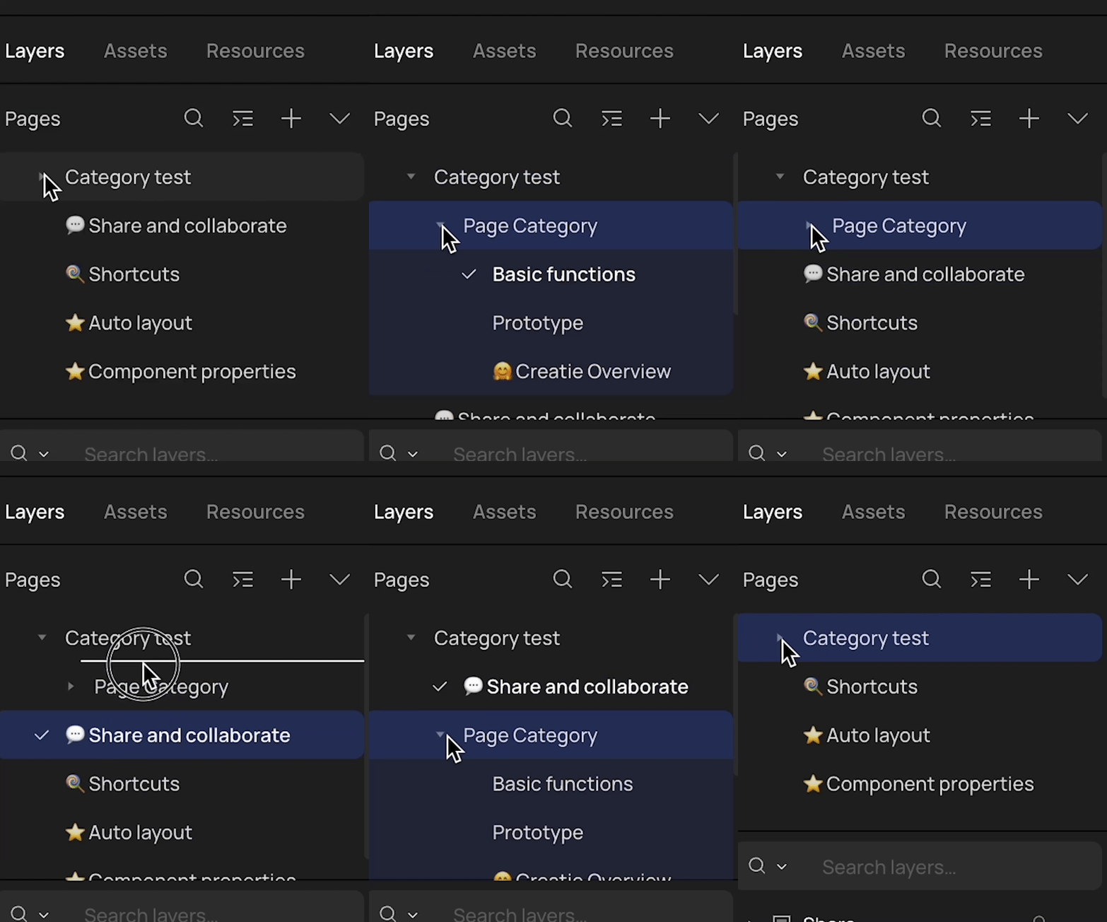
You can group pages into “folders”!! A dream come true;
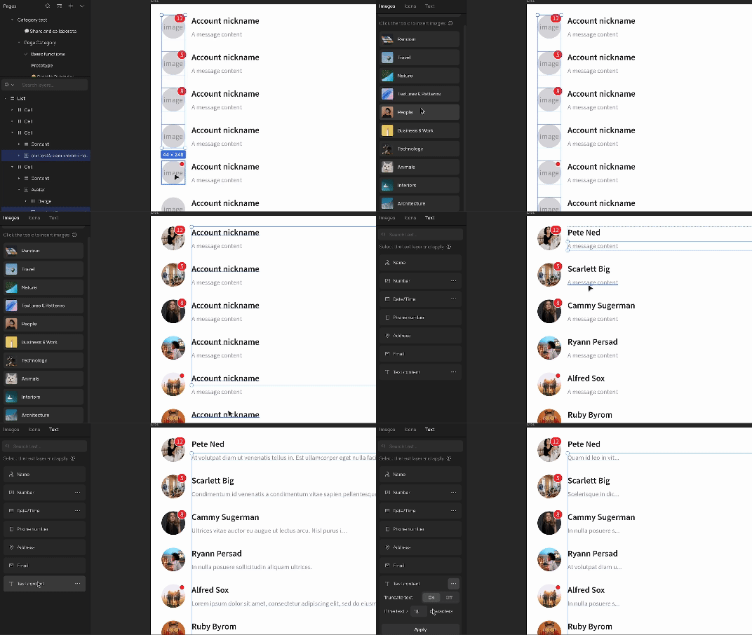
“Resources” allows you to quickly complete the interface with example information (there’s a plugin in Figma for this, but it’s cool to have it integrated because it’s frequently used). The icon library is also very complete;
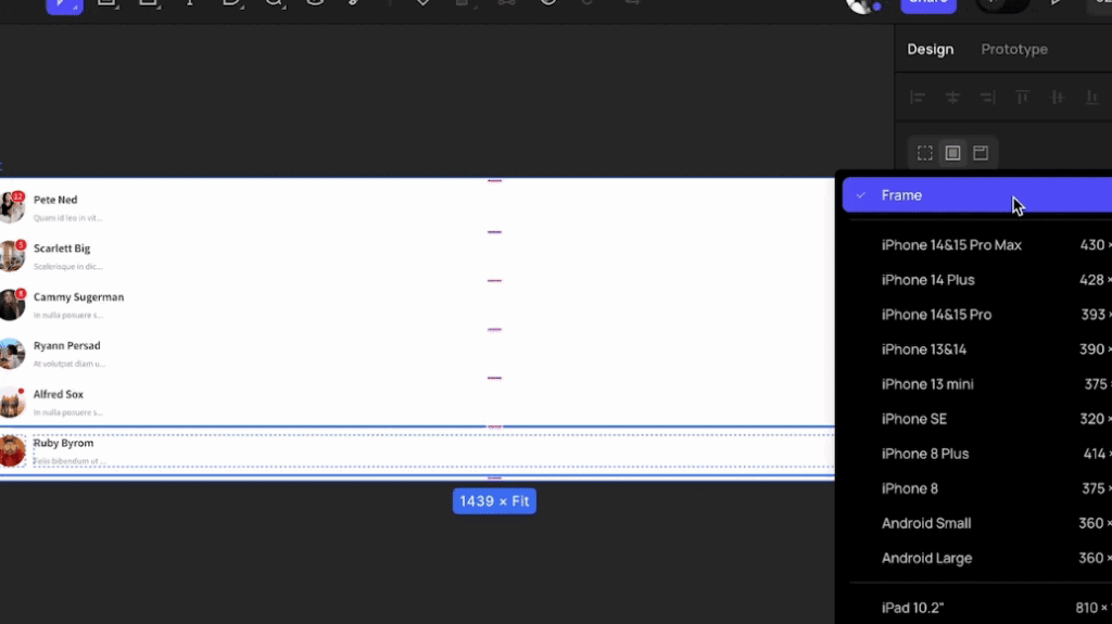
You can change the frame by selecting from a list, without having to manually adjust the size;
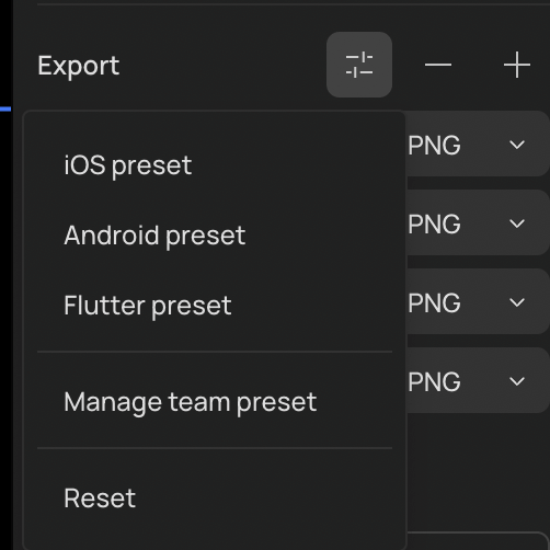
The export feature has presets.
- I didn’t find variants, nor did I see the functionality for minimum and maximum heights/widths;
- Some shortcuts are missing, like changing the auto-layout to “auto” by double-clicking;
- The cmd+shift+r for replace works! I’m grateful they kept the standard, I use it a lot;
Prototyping and Sharing in Creatie
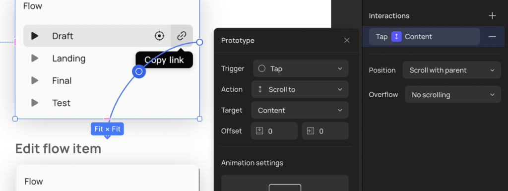
Prototyping in Creatie is very similar to Figma, so nothing new here. But sharing with access history was a pleasant surprise. 🙂

Dev Mode
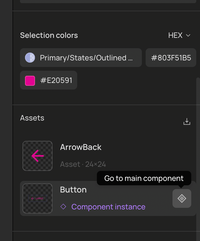
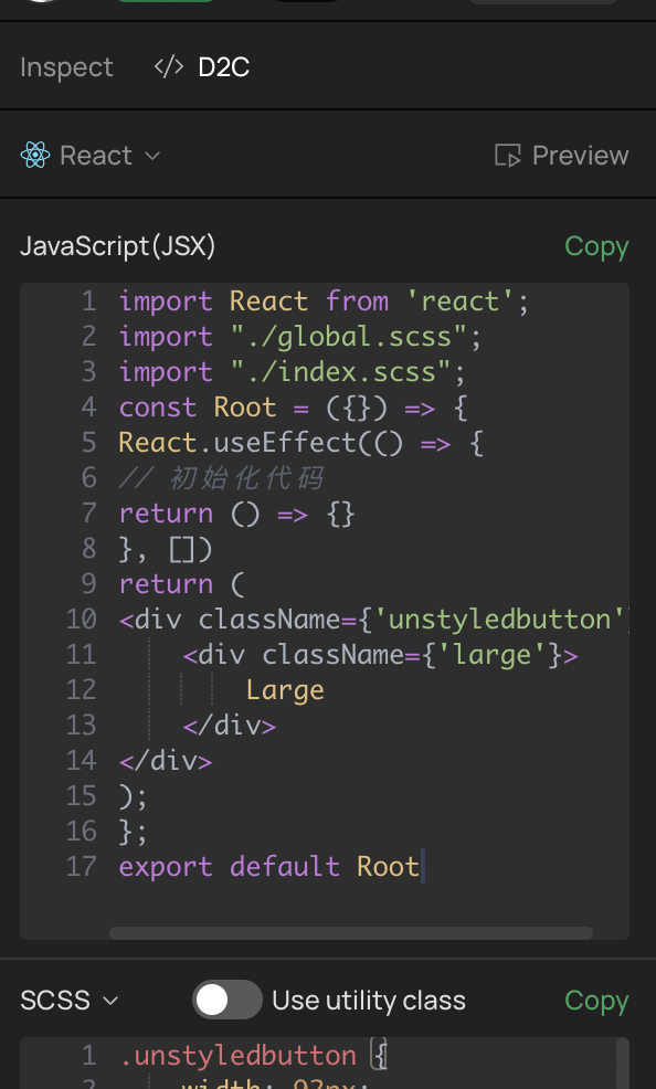
The developer mode (Dev mode) in Creatie is quite similar to what Figma offered in its early versions. One limitation I noticed is the lack of a feature to compare versions of a component or add explanatory notes. However, a positive point is that Creatie displays codes for React, Vue, among others, which is extremely useful for developers.
AI Innovations and Tools
Magic Styles
“Magic Styles” was one of the novelties I liked the most. Based on the selection of layers, it sets up a Style Guide with the tokens (colors, fonts, borders, shadows) extracted. It doesn’t create components or list existing components, it’s more for styles, really.
Two points for improvement, IMO:
- Being able to choose which Library to export the styles to. Currently, it adds them as styles in the current file itself.
- Some way to audit existing styles. Currently, it just adds them and that’s it, no warning, no preview (and Ctrl/Cmd + Z doesn’t work). This can lead to duplicated styles in teams with designers working simultaneously.
Audit
One of the features I liked the most. When we use Figma for ideation/approval of ideas, especially in a more agile environment, sometimes we design without much care for styles and components. And if that design is approved, we have to go back and link it with the Design System. The Audit basically does this with a few clicks!
However, it only works with styles for now ( 🙁 ). Maybe one day it will work with components too.
Wizard
Very interesting, especially for creating wireframes and accelerating the ideation process. If you already work with an established Design System, you might not find anything revolutionary, since it doesn’t automatically adapt to the brand’s colors and fonts. However, adjusting these elements to create new components isn’t complicated, especially if you use the “Audit” tool to assist in the process.
Migrating from Figma to Creatie: Is it easy?
Importing a file with components
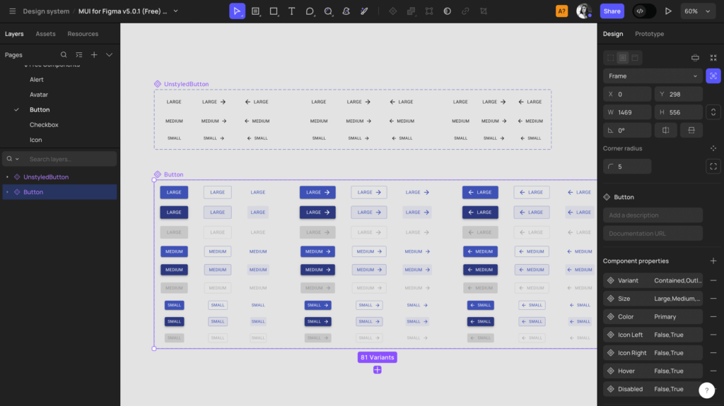
I used a robust Figma file from the Material-UI (MUI) Design System (DS) to test the import in Creatie. Despite being a large file containing many components, I was impressed by the speed of the import. Even more notable was the fact that Creatie managed to import all the components correctly, without errors or adjustments needed.
Using the imported Design System
Out of respect for my laptop’s processing power, I decided to test and move the buttons to a separate file, thus avoiding publishing 1818 items at once from the original file. Transferring a component to another file was effortless, using Ctrl+C, Ctrl+V, as we are accustomed to in Figma.
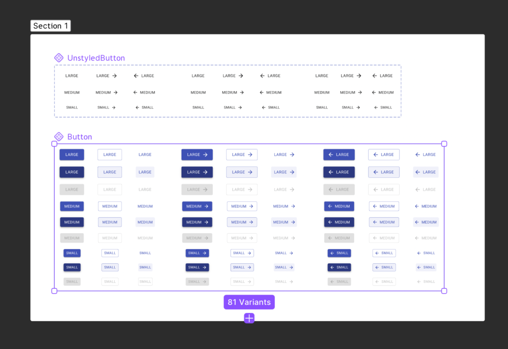
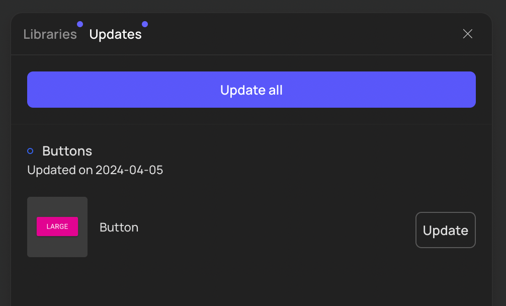
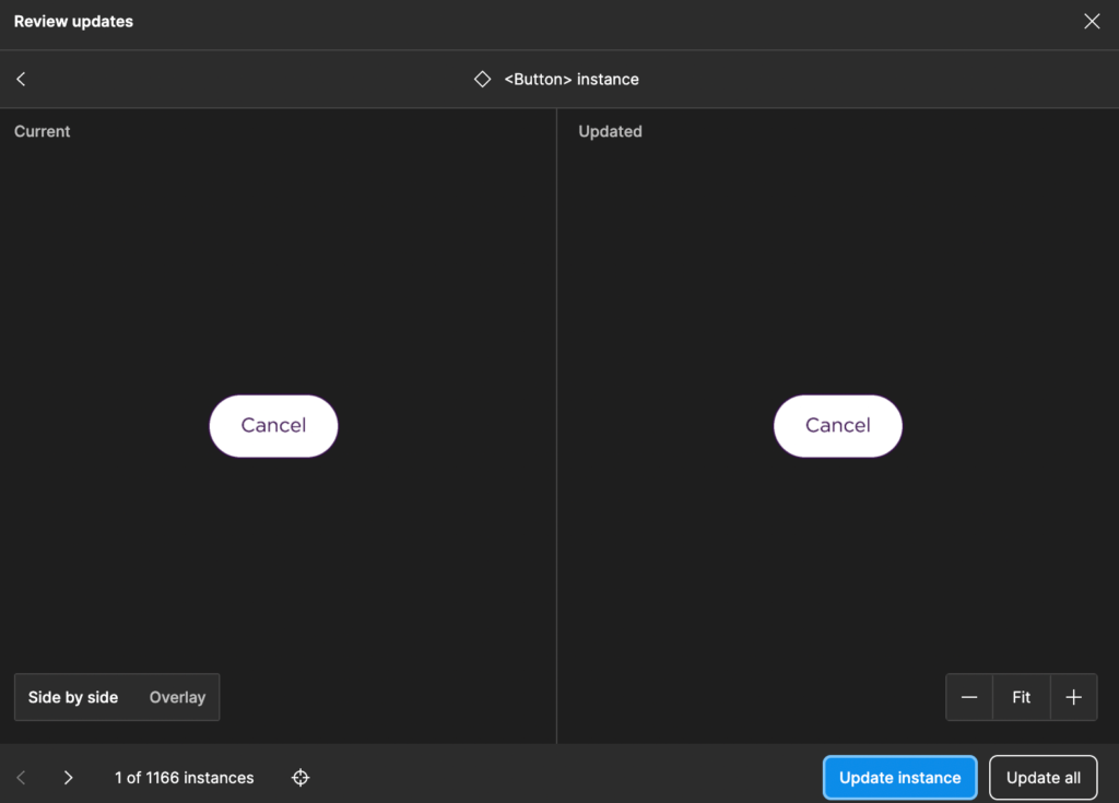
I published the buttons and used them in another file without issues. Thereafter, I made changes and published again. Here, I missed a Figma feature: comparing versions before accepting the changes in the file.
Magicon and Image Enhancer
Tools for generating and processing images. More useful for working with Landing Pages and marketing campaigns. Without selecting existing images, or sending a reference image, the results are… strange.
Conclusion
Creatie is very similar to the industry leader, Figma. In some aspects, it stands out, such as page organization, file management, and AI to assist in developing and maintaining style guides. However, in other aspects, Figma has the upper hand.
Oh, regarding data protection: Their policy is similar to Figma’s, ensuring protection, but they don’t have much control over third-party processing (AI, probably). I wouldn’t put passwords or VERY sensitive data in it, just to be cautious.
For now, I’m keeping an eye on updates and eager to see how Creatie will develop. I’m optimistic, but I see points that need maturation. Depending on the price, a conversation about migration with the team might be coming soon. The developers were quite excited about the Dev Mode, which shows code already in React, and I’m excited about the possibilities of keeping everything neat. Let’s see how Figma reacts too 👀.
Bonus: Belinha OBSERVING any upcoming news from Creatie.

By: Anna Erbetta
